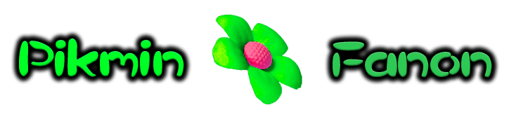
Forum:New logo proposal: Difference between revisions
From Pikmin Fanon
m (→Vote) |
No edit summary |
||
| Line 27: | Line 27: | ||
===Alternate Proposal (Include Image Below)=== | ===Alternate Proposal (Include Image Below)=== | ||
===Alternate 1=== | |||
Hmm, I'm not really a fan of the font used in the proposals above. Also, I kind of like the test used in the background image, as well as the cobweb image in the current logo. So here's my suggestion combining the two: | |||
[[File:PikminFanonLogoProposal Adam.jpg|left]] | |||
<br clear="all" /> | |||
--[[User:Adam|Adam]] 07:14, 30 October 2010 (EDT) | |||
Revision as of 11:14, 30 October 2010
| Proposal A | Proposal B | Proposal C | Proposal D | Proposal E |
|---|---|---|---|---|
 |
 |
 |
 |

|
Vote
Put a comment and your sig under the section to vote!
- Once the vote has been decided, we will change the theme of the wiki to the corresponding color.
Keep the old logo
The background logo
Proposal A
Proposal B
- I think that this Logo is the best because it fits the theme of the wiki and Pikmin. -Peanut64 (Talk)
Proposal C
Proposal D
Tied between this one and C, but it is blue, my favorite color. :) --User:Gamefreak75/Sig
Proposal E
Alternate Proposal (Include Image Below)
Alternate 1
Hmm, I'm not really a fan of the font used in the proposals above. Also, I kind of like the test used in the background image, as well as the cobweb image in the current logo. So here's my suggestion combining the two:

--Adam 07:14, 30 October 2010 (EDT)